
Have you ever walked into a shop in the Lowcountry that just instantly felt right? Maybe the furniture was arranged perfectly, the colors were soft and inviting, and everything you needed was exactly where your eye landed. You didn't have to search or ask where something was or if they had it. That instant feeling of "I get this" is what good design is all about, and it’s the exact same experience your website needs to create for your local customers. You might think web design is all about fancy photos or the latest tech tricks, but the most powerful principle is something much simpler: visual hierarchy.
Visual hierarchy is the secret language of design. It’s the intentional way a designer arranges elements like text, images, and buttons on a page so that your eye is naturally guided to the most important information first. Think of it as a helpful, silent host on your website, gently directing visitors from the entryway to the main features and then, most importantly, to the checkout or contact area. When this process works well, your site feels intuitive and clean. When it fails, your visitors leave, feeling overwhelmed or lost.
In the beautiful, often historic Lowcountry, branding is everything. Our local economy thrives on charm, trust, and a sense of place. A bad website, one that doesn't respect visual hierarchy, can instantly undermine that local appeal. Imagine a visitor comes to your site. Their attention is scattered everywhere because every font is the same size, every image is equally large, and the main "Contact Us" button is hidden in a corner, shouting no louder than the privacy policy. It’s digital chaos, and it tells the customer that your business is disorganized and hard to deal with.
So, now what? You don’t need a massive, expensive overhaul to fix this; you just need to understand the three simple tools designers use to establish a clear hierarchy.
First is Size. Bigger elements naturally grab more attention. Your main call to action, the "Shop Now" or "Get a Quote" button, should be the largest, most prominent element on the page. Your main headline, which announces your local value, should be bigger than the paragraphs of text that follow. If everything is the same size, nothing is important, and the user has to work to find out where to look.
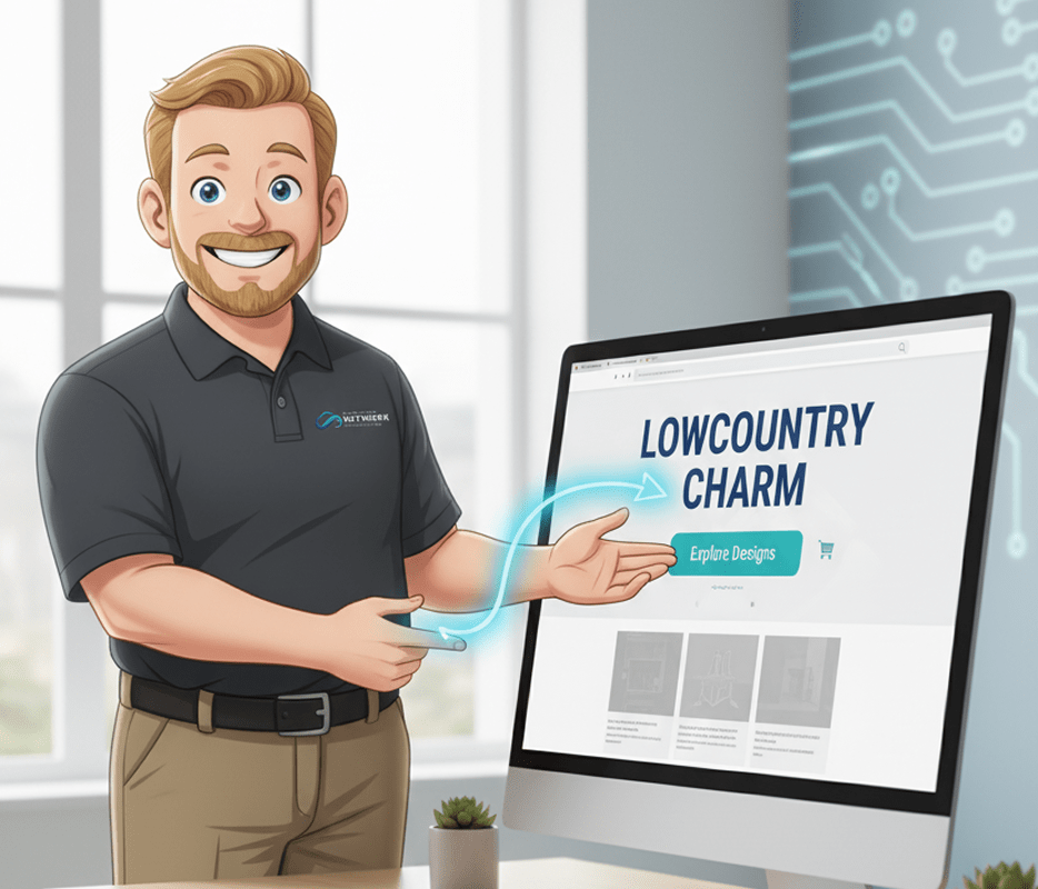
Second is Color and Contrast. In the Lowcountry, we often favor soft, natural color palettes. This is great for setting a calming mood, but it makes contrast vital. The most important action a user can take should be highlighted in a distinct, contrasting color that pops off the background. For example, if your brand uses a lot of coastal blues and creams, that key button needs to be an accent color, like a strong indigo or a warm terra cotta, ensuring it’s the first thing the eye catches. Color tells the user, "This is where you should go next."
Third is Spacing and Placement. This is arguably the most essential tool for conveying elegance and clarity, which is perfect for Lowcountry branding. Designers use white space or negative space like a spotlight. When an element is surrounded by generous amounts of empty space, it immediately appears more important, more professional, and less cluttered. This is how you convey that desirable sense of unhurried quality. Instead of cramming five different promotions into the header, use ample space around a single, powerful message. This placement naturally guides the user's eye down the page in a logical, guided conversation.
Implementing these three principles, size, color, and spacing, ensures that your website speaks with the same local authority and clear intention as your most successful physical storefront. When a visitor arrives, they instantly know what you do, why you matter, and how to take the next step. This eliminates the digital friction that causes users to abandon sites and, most importantly, reinforces the local charm and professionalism of your brand. You should never underestimate the power of design to save your customers time and to build immediate trust. An investment in clear visual hierarchy is an investment in your local reputation and in making the online experience as pleasant as a walk through the City Market. If you feel like your website is sending mixed signals or if you're struggling to translate your local brand's charm into a clean, effective digital design, we can help. We specialize in making sure the look and functionality of your site work together to drive real business growth.
Ready to make your website an elegant, efficient reflection of your brand? Let’s talk about maximizing your design performance today.
Call us at 854-832-1117 or visit us online at lcnetworkconsulting.com to schedule a consultation.
Better visuals and faster pages help customers choose you.
Start Your Website Refresh